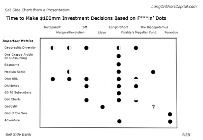
So I'm doing my job, analyzing a company that doesn't make the widgets, but instead, supplies the engineered material which goes into making the products which protect the machines which make the widgets. They need millions of dollars to finance the widget-producing-protecting-producing procuess. The management and their bank presented the company to a meeting of potential investors with a combination of numbers, absurdist terms like "Syneries from A Vertical Roll-Up Strategy" and "Greenshoe MFN Language" and slides. They were trying to sell us on why we should invest tens or even hundreds of millions in their company. Then they whipped out this slide. Note that the original slide had an X axis which listed the company and its competitors and a Y axis which listed abritrary cherry picked categories; I have edited the slide to protect the parties involved:

Dots? That chart is the basis upon which I should direct our investors' money? By dots? AND HALF DOTS? Some poor 4.0gpa-Ivy league grad sold his/her soul to the I-Banking Gods to spend 90 hours per week creating crap like this?
That's the Sell Side, baby.
